 Themes, Styles, and PreferencesThemes, Styles, and Preferences
The basic use of styles and themes in Android interfaces has been touched upon in previous projects (for example, in the discussion of Android User Interfaces and Playing Video). A general introduction may be found in the Styles and Themes guide and available themes are documented under R.style. In this project we give a somewhat more extensive discussion, addressing more advanced issues associated with
Because we shall use some specific themes and methods that were introduced in more recent versions of Android, we shall restrict this application to devices running API 15 and above.
Before writing any code we give a very basic overview of styles and themes. (Styles and themes are basically the same thing, but in the usual terminology styles are applied to individual Views and themes are applied to full Activities.)
There are many Android attributes and styles and themes. These may be specified in the app manifest file, in XML files, or directly in the Java code.
the first line in red specifies the Android (Honeycomb) Holo.Light theme for the entire application and the second line in red specifies the Android NoTitleBar theme for the activity corresponding to the class NiceApp. Notice that<?xml version="1.0" encoding="utf-8"?> <manifest xmlns:android="http://schemas.android.com/apk/res/android" package="com.lightcone.niceapp" android:versionCode="1" android:versionName="1.0" > <uses-sdk android:minSdkVersion="7" /> <application android:theme="@android:style/Theme.Holo.Light" android:icon="@drawable/nice_logo" android:label="@string/app_name" > <activity android:name=".NiceApp" android:label="@string/app_name" android:screenOrientation="portrait" android:theme="@android:style/Theme.NoTitleBar"> <intent-filter> <action android:name="android.intent.action.MAIN" /> <category android:name="android.intent.category.LAUNCHER" /> </intent-filter> </activity> <activity android:name=".Prefs" android:label="Preferences"> </activity> </application> </manifest>
(notice that this attribute is not preceded by android:)<TextView style="@style/FunkyFont" android:text="@string/hello" />
where we note explicitly that the theme must be specified using the setTheme(int id) method that Activity inherits from ContextThemeWrapper before setContentView is invoked.public void onCreate(Bundle savedInstanceState) { super.onCreate(savedInstanceState); // following must precede setContentView(). setTheme(android.R.style.Theme_NoTitleBar); setContentView(R.layout.taskactivity1); }
If used individually, Android themes override each other. Often it would be useful to combine multiple themes into a single compound theme (for example, one that has the properties of both Holo.Light and NoTitleBar). Let us now see how to do that.
We may place our styles and themes definitions in the file res/values/styles.xml,
within the
<resources>
    .
    .
	<!-- Use the Android Dialog theme as the base for a new compound theme DialogNoTitle -->
	<!-- Apply using attribute android:theme="@style/DialogNoTitle in manifest file for activity, -->
	<!-- or setTheme(R.style.DialogNoTitle) before setContentView() in code. -->

	<style name="DialogNoTitle" parent="@android:style/Theme.Dialog">
	<!-- hide the Window Title -->
	<item name="android:windowNoTitle">true</item>
	<item name="android:windowBackground">@color/bgcolor</item>
	<item name="android:colorBackground">@color/bgcolor</item>
	<item name="android:textColor">@color/dialog_brown</item>
	</style>

	<style name="DialogNoTitleDark" parent="@android:style/Theme.Dialog">
	<!-- hide the Window Title -->
	<item name="android:windowNoTitle">true</item>
	<item name="android:windowBackground">@color/bgcolor2</item>
	<item name="android:colorBackground">@color/bgcolor</item>
	<item name="android:textColor">@color/buttontextcolor</item>
	</style>
.
.
</resources>
The content of each <style> </style> tag defines a new theme, with name the name by which we shall reference it, parent the base theme from which the new theme is derived, and the content of the enclosed <item> </item> tags each adding new attributes to the base theme. For example, the first new custom theme DialogNoTitle adds to the properties of the Android Theme.Dialog theme the attribute windowNoTitle. These user-defined composite themes can then be invoked either in the manifest file or in code, just as for normal themes.
Additional examples of defining custom styles and themes may be found in res/values/styles.xml for the project
Progress Bar Example, where we implement some custom styles for
ProgressBar widgets.
The file res/values/styles.xml will likely already contain style definitions defining the default style of the app.
For example,
See the discussion in Styles and Themes. |
With the preceding as introduction, let us now implement an app that illustrates the use of composite themes, demonstrates how the display theme can be changed at runtime by logic in the Java code, and demonstrates how to store theme settings so that they persist across sessions.
Because we are illustrating several different capabilities with this app, it requires a number of (mostly small) Java and XML files. Rather than pasting in each according to our usual procedure, we are going to just download and install the project directly, and then we shall demonstrate how it works and describe why it works. So begin by retrieving the the project ThemesDemo from GitHub. Instructions for installing it in Android Studio may be found in Packages for All Projects.
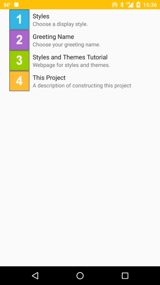
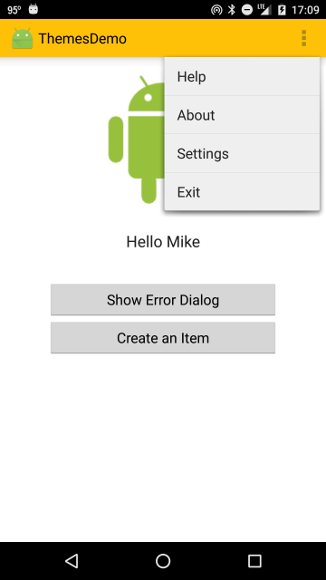
Launch the app on a device or emulator running at least API 19. On the opening screen the overflow menu on the Task Bar (three vertical dots at upper right) can be opened and Settings selected to give the preference headers screen shown below.
|
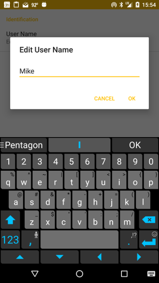
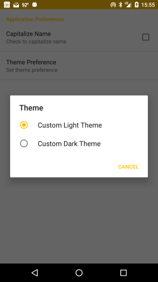
Each of the headers on this screen defines different preference options or links. Clicking on the Greeting Name header gives an option to input your user name, as illustrated in the below-left figure, while clicking on the Styles header gives the option to choose an app theme (customized version of Holo Light and Holo Dark, as discussed further below) or to choose whether the displayed username will be given in all caps, as illustrated in the figure below right.
 |
 |
The last two headers on the preferences header screen illustrate how to link to potentially relevant material. (These particular links belong more properly on the Help page, but are included here to illustrate a technique.)
| The icons displayed to the left of the headers on the preferences headers screen are from resources such as icon1.png included in the res/drawable directory. In this example they are just simple drawings but in a realistic application you would want to replace them with more appropriate icons. |
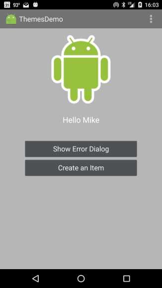
By toggling the theme between the two options given in the preferences, we change the display theme of the entire app. For example, the following two images show the opening screen displayed with the Custom Dark and Custom Light choices, respectively.
 |
 |
The following two images show the Help item of the top ActionBar menu displayed with the dark and light themes, respectively.
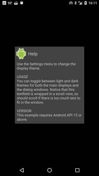 |
 |
The following two images show the dialog window launched by the first button on the opening screen (with label Show Error Dialog,) with the dark and light themes, respectively.
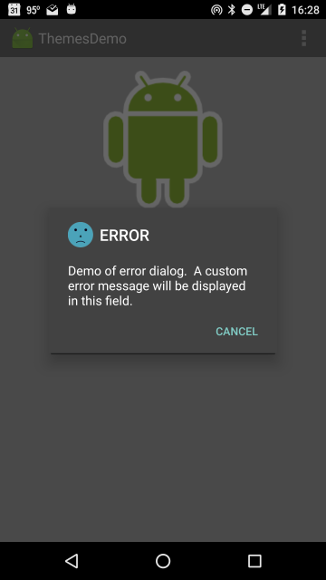 |
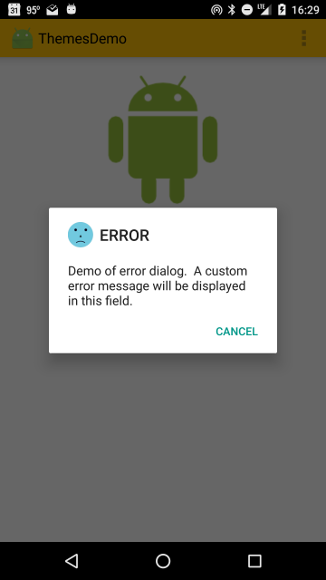 |
Finally, on the second screen (launched by a click on the second button of the opening screen) we illustrate a technique where a click on one of the two buttons displayed there launches another activity directly, while a long press on the same button instead opens a dialog window in which information about the activity to potentially be launched is given and the user has the choice of cancelling the dialog or pressing the Select this Task button to launch the activity. The following figure illustrates this functionality with the light themes preferences set.
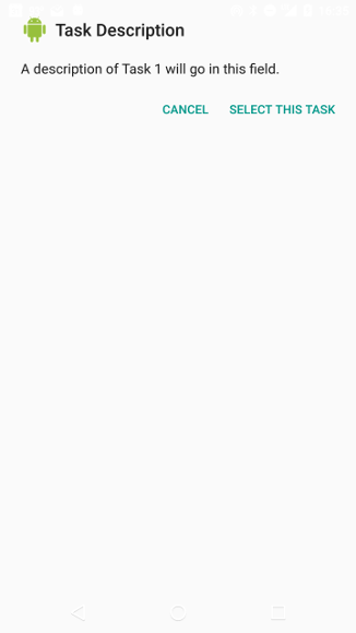 |
The opening screen displays two buttons, the second of which opens a second screen and the first of which demonstrates the launch of a dialog box displaying customized error messages. The first button and its actions are standard XML layout, event handling, and use of Intents to launch new Activities that have been discussed in many other projects. The second button launches a floating Dialog using techniques that have been discussed in Dialogs, Alerts, and Notifications. The buttons have both OnPress and OnLongPress handlers attached to them, and the corresponding actions are defined in the methods of MainActivity.java.
Pressing the overflow menu button of the phone on the top bar while the opening screen is displayed opens an options menu with the following choices
|
Selection of Settings produces a preferences headers menu (see the first image above) and choices in the preferences headers menu cause parameters to be set and stored in SharedPreferences. The key class responsible for this in the present app is defined by Prefs.java.
The essentially new ingredients here are the definition of multiple compound display themes for the app, the use of logic within the Java classes that decides which theme to implement at runtime, based on parameters stored in SharedPreferences, and the use of a fragments-based API to manage setting and storing the SharedPreferences. The basic procedure for the first two is:
The preferences screen is opened by clicking Settings in the action bar overflow menu. This fires an Intent to launch the Prefs class (see the onOptionsItemSelected(MenuItem item) handler in MainActivity.java). The class Prefs extends PreferenceActivity, which is the base class allowing an activity to show a hierarchy of preferences to the user.
| Prior to Android 3.0 (API level 11), PreferenceActivity implemented the display of a single set of preferences. Implementation of a single level of preferences now uses PreferenceFragment, and PreferenceActivity in its new mode now displays one or more headers of preference, with each preference header associated with a PreferenceFragment to display preferences associated with that header. By subclassing PreferenceActivity and implementing the method onBuildHeaders(List<Header> target) in Prefs.java, we implicitly switch Android into the new headers + fragments mode. |
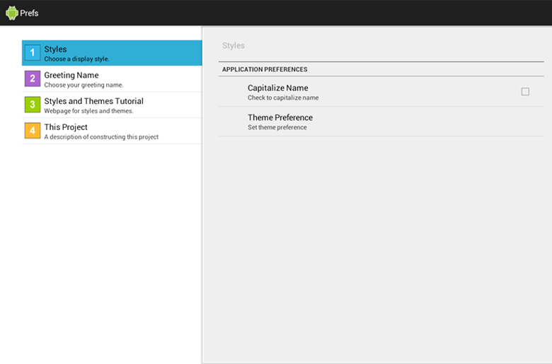
In the method onBuildHeaders(List<Header> target) we call loadHeadersFromResource with an argument specifying res/xml/preference_headers.xml as the resource. The file preference_headers.xml has the content
<preference-headers xmlns:android="http://schemas.android.com/apk/res/android" >
      <header
         android:fragment="<YourNamespace>.themesdemo.Prefs$Prefs1Fragment"
         android:icon="@drawable/icon1"
         android:summary="Choose a display style."
         android:title="Styles" />
      <header
         android:fragment="<YourNamespace>.themesdemo.Prefs$Prefs2Fragment"
         android:icon="@drawable/icon2"
         android:summary="Choose your greeting name."
         android:title="Greeting Name" >
      </header>
      <header
         android:icon="@drawable/icon3"
         android:summary="Webpage for styles and themes."
         android:title="Styles and Themes Tutorial" >
         <intent
               android:action="android.intent.action.VIEW"
               android:data="http://developer.android.com/guide/topics/ui/themes.html" />
      </header>
      <header
         android:icon="@drawable/icon4"
         android:summary="A description of constructing this project"
         android:title="This Project" >
         <intent
               android:action="android.intent.action.VIEW"
               android:data="http://eagle.phys.utk.edu/guidry/android/themesDemo.html" />
      </header>
</preference-headers>
which implements the headers displayed in the first figure shown above. These headers define two kinds of actions. In the first header, the
android:fragment="<YourNamespace>.themesdemo.Prefs$Prefs1Fragment
attribute associates the header with a fragment defined by the static inner class Prefs1Fragment (which is defined inside Prefs.java and extends PreferenceFragment).
| The preceding expression employs a standard Java construction. To reference a static inner class from outside the (outer) enclosing class we specify the fully qualified path to the outer class, add "$", and then add the name of the inner class. |
The event handling is taken care of automatically by Android so when we click on the first header this causes the preference fragment defined by Prefs$Prefs1Fragment to be executed. Prefs1Fragment first uses the PreferenceManager to set default values of the preferences to be displayed by reading the initialization file res/values/preferences_initialize.xml, which has the content
<?xml version="1.0" encoding="utf-8"?>
<PreferenceScreen xmlns:android="http://schemas.android.com/apk/res/android" >

      <CheckBoxPreference
         android:defaultValue="false"
         android:key="caps_pref"
         android:summary="Check to capitalize name"
         android:title="Capitalize Name" />

      <ListPreference
         android:defaultValue="1"
         android:dialogTitle="Theme"
         android:entries="@array/labels_list_preference"
         android:entryValues="@array/values_list_preference"
         android:key="list_preference"
         android:summary="Set theme preference"
         android:title="Theme Preference" />

</PreferenceScreen>
This will initialize two widgets:
attribute that will allow us to access its current value from all classes in the project by referencing this key with code likeandroid:key="caps_pref"
which uses PreferenceManager to get an instance of SharedPreferences, and then uses its getBoolean method with the key "caps_pref" to retrieve the current value of the stored preference.SharedPreferences sharedPref = PreferenceManager.getDefaultSharedPreferences(context); boolean isChecked = sharedPref.getBoolean("caps_pref", false);
attributes, which reference string arrays defined in res/values/arrays.xml:android:entries="@array/labels_list_preference" android:entryValues="@array/values_list_preference"
This widget will store a String in SharedPreferences corresponding to the values_list_references choice "1" or "2" with the key list_preferences that will permit this preference value to be accessed from all classes in the package.<?xml version="1.0" encoding="utf-8"?> <resources> <string-array name="labels_list_preference"> <item>Custom Light Theme</item> <item>Custom Dark Theme</item> </string-array> <string-array name="values_list_preference"> <item>1</item> <item>2</item> </string-array> </resources>
| String arrays are simple resources referenced by the name attribute. Thus, it is often convenient to place multiple string arrays in the same file, as we have done above in res/values/arrays.xml. |
The inner class Prefs1Fragment then uses the method addPreferencesFromResources(id) that Prefs1Fragment inherits from PreferenceFragment to inflate the XML resource res/xml/fragmented_preferences.xml
<PreferenceScreen xmlns:android="http://schemas.android.com/apk/res/android" >

      <PreferenceCategory android:title="Application Preferences" >
         <CheckBoxPreference
               android:key="caps_pref"
               android:summary="Check to capitalize name"
               android:title="Capitalize Name" />

         <ListPreference
               android:dialogTitle="Theme"
               android:entries="@array/labels_list_preference"
               android:entryValues="@array/values_list_preference"
               android:key="list_preference"
               android:summary="Set theme preference"
               android:title="Theme Preference" />
      </PreferenceCategory>

</PreferenceScreen>
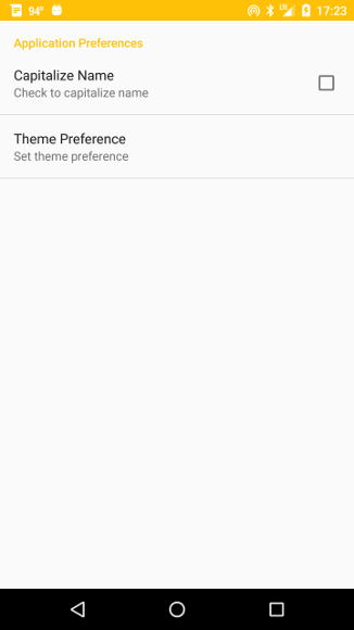
and adds the corresponding preference hierarchy to the current preference hierarchy. The resulting display on a phone looks like the figure below left, and since the preferences fragment implements automatically the event handling, clicking on the Theme Preference option gives the dialog choice shown in the figure below right.
 |
|
The shared preferences under the second preference header (Greeting Name) are handled in a quite analogous manner through the fragment associated with the inner class Prefs2Fragment in Prefs.
The use of classes extending PreferenceActivity and PreferenceFragment to handle preferences is particularly useful because
to retrieve the current values of name-value pairs stored in SharedPreferences. For example, the method toggleTheme() in MainActivity.java uses such accesses to SharedPreferences to determine the theme and the user name that it should display when the opening screen is launched.SharedPreferences sharedPref = PreferenceManager.getDefaultSharedPreferences(this); isChecked = sharedPref.getBoolean("caps_pref", false); String lister = sharedPref.getString("list_preference", "1"); String myName = sharedPref.getString("edittext_preference", "");
|
|
|
For these reasons, it is strongly recommended that you implement shared preferences using fragments and a hierarchy of preference screens by subclassing PreferenceFragment and PreferenceActivity, as illustrated here.
| The complete project for the application described above is archived on GitHub at the link ThemesDemo. Instructions for installing it in Android Studio may be found in Packages for All Projects. |
Last modified: July 25, 2016