 Android User Interfaces Android User Interfaces
Since a user will typically interact visually with an Android application, it is important to understand how Android lays out user interfaces. In this section we give a brief overview. See the Android User Interface document for more detail.
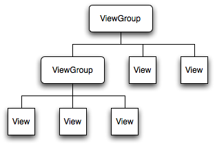
Visually, an Android window is a hierarchy of views, which are objects derived from the View and ViewGroup classes.
Each view in the hierarchy controls a particular rectangular subspace within the window.
The following figure illustrates a view hierarchy
|
The setContentView(View view) method of Activity is used to place a view hierarchy within an activity window, where the content view is the View object at the root of the view hierarchy (the topmost ViewGroup in the preceding figure). Android handles the drawing of the view hierarchy but the Activity must supply the root node as the starting point. The essential procedure is that the root node of the hierarchy requests that its child nodes draw themselves, and in turn each view group node requests that its children draw themselves. Children may request a size and location within the parent, but the parent object has the final say-so on size and position for the child objects. This will be adequate introduction for our initial purposes; a more extensive discussion of rendering the view hierarchy within an Android window may be found in How Android Draws Views.
The recommended way to lay out the view hierarchy is with an XML layout file. The name of an XML element in this file is in one-to-one correspondence with a Java class that it represents: a <TextView> element creates a TextView in your UI, a <LinearLayout> element creates a LinearLayout view group, and so on. Here is an example of a simple XML layout file:
<?xml version="1.0" encoding="utf-8"?>
<LinearLayout xmlns:android="http://schemas.android.com/apk/res/android"
   android:layout_width="fill_parent"
   android:layout_height="fill_parent"
   android:orientation="vertical" >
   <TextView android:id="@+id/text"
      android:layout_width="wrap_content"
      android:layout_height="wrap_content"
      android:text="Hello, I am a TextView" />
   <Button android:id="@+id/button"
      android:layout_width="wrap_content"
      android:layout_height="wrap_content"
      android:text="Hello, I am a Button" />
</LinearLayout>
This layout would create a TextView and a Button, arrayed vertically in a linear layout in the Android window (we will explain the details of such a listing later). As long as you follow the rules, you do not have to worry about managing the relationship between XML layout of the UI and the Java code that will reference it. Basically you must just place correctly written code in a standardized set of directories and Android will do the rest. When you load a layout resource, Android automatically initializes these run-time objects, corresponding to the elements in your layout.
Menus are another important part of the UI but, as we describe below, layout and event handling are dealt with somewhat differently for menus than for other UI widgets in Android and the nature of the Menu user interface has evolved between early and current versions of Android.
Before Android 3.0 (API level 11) Android devices commonly had a dedicated Menu button. Following API level 11, Android devices were no longer required to have a Menu button and app developers were encouraged to move the functionality of the Menu button into the Action Bar. Even more recently, the action bar has evolved into the Toolbar, which is a more flexible version of the Action Bar.
Even though the best-practices user display of menu items has changed following Android 3.0, the functionality of the Menu APIs remains largely the same. Since many modern Android devices do not have an explicit Menu button, apps designed for them will still use much of the Menu API functionality, but your app should not assume the presence of a Menu button to initiate that functionality (use an Action Bar instead). Furthermore, because of Google the backward-compatibility Support Library, it is possible to implement an Action Bar even on older versions of Android. This complicates the discussion even further if one is supporting both new and older versions of Android. We shall assume programming consistent with devices running Android 4.0 or later and not deal much with compatibility issues for older versions here.
| By compatibility in preceding statements, we mostly mean compatibility of newer options in the API with devices running earlier versions of the API that did not implement those options. Android is for the most part forward and backward compatible without doing anything special. Programs written in Android 1.6 adhering to Android best practices will commonly work either as-is, or with a few small tweaks, under Android 4.4, and programs written under Android 4.4 will often work fine on devices running earlier versions of Android, unless those programs use explicitly features of the API that were introduced after the earlier versions. Even in this case, by using the Support Library, it is often possible to deploy features introduced in later versions of the API on devices running older versions. The Action Bar one such feature; Fragments are another. |
There are three general types of menus in Android:
In the following we shall give a brief overview of the Menu prior to Android 3.0 (oldschool) and the modern Action Bar (newschool). For a more extensive discussion, consult the Android Menus document.
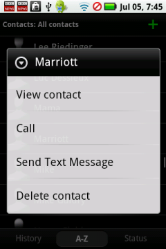
The left figure below illustrates an options menu produced when the MENU key is pressed for an older Android phone on its default screen and the right figure below shows a context menu produced on the same phone after a long press on an entry in the Contacts list.
 |
 |
| The Android Menus document contains further information about creating and using various kinds of menus in Android. |
In Android 3.0 and beyond it is preferred that the options menu be handled in the ActionBar or Toolbar classes. An action bar is a dedicated piece of real estate at the top of a screen that generally persists through the screens of the app. It identifies the app and the user location in the app, and provides user actions and navigation modes. It provides a standardized interface across applications that is adapted automatically by the system for different screen environments. Generically, an Action Bar is organized as in the following figure,
|
and has the basic pieces labeled by the numbers in the above figure:
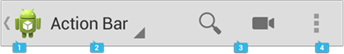
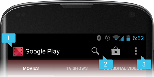
The figure below illustrates an actual action bar, showing (1) the app icon and label, (2) two action items, and (3) the action overflow button (the three vertical dots on the right) that pops up a menu with additional choices.
|
The general features of action bars are discussed in Action Bar and design issues for action bars are elaborated in this document.
In dynamical applications you will often want to populate view groups with non-static data from some external data source. For example, a display of the current temperature in several different cities must display temperature data supplied continuously from an external source. This is termed data binding to the View. In Android this is handled by using an AdapterView as the ViewGroup, with each child View populated by an Adapter. An AdapterView object is a ViewGroup that determines its child views based on a given Adapter object. The Adapter acts as a bridge between the data source and the AdapterView, which displays it.
| The binding of data to views is described more extensively in this AdapterView document. |
Good design is an important component of a user-friendly and aesthetically appealing user interface. One important aspect of good design is achieving a uniform look and feel for applications, which has positive implications for both aesthetics and functionality. One way to achieve this is through styles and themes:
Styles and themes allow design to be separated from content (thus they function in a way similar to Cascading Style Sheets in webpage design), which facilitates maintenance and extension of projects.
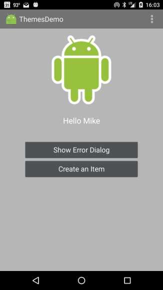
Android provides some default style and theme resources out of the box, and you can also declare your own custom styles and themes. The following figures taken from the Themes, Styles, & Preferences project illustrate the use of Android styles and themes.
 |
 |
In this example styles and themes have been used to separate the content from the design: the left and right figures have exactly the same content, but they have different looks, and the programmer does not have to write any additional code to accomplish this, once the theme has been defined.
| A more extensive discussion of using existing styles and themes, and constructing your own, may be found in the Android Styles and Themes document and in the Themes, Styles, & Preferences project. |
The layout of UI widgets described above will not be very useful unless we define event handlers to respond to events associated with the widgets. We shall give various specific examples later but remark here that this can be implemented in one of two basic ways.
| A more extensive discussion of handling UI events within Views may be found in Input Events. |
Last modified: July 25, 2016