 Navigation Drawers and Such Navigation Drawers and Such
In newer versions of Android some rather creative and useful widgets have been introduced. This project will demonstrate how to use four of them:
In addition, we shall see how to created and use vector-graphic icons in the menus that will be created.
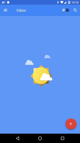
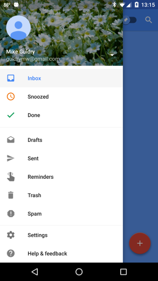
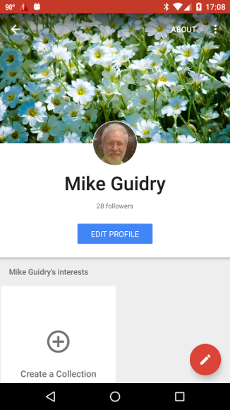
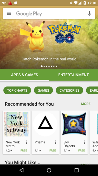
Various implementations of these widgets may be found in Google's own apps. For example, the figure below left shows the main page of the Google Inbox email app, which displays a toolbar/actionbar at the top populated by several widgets, and a floating action button at the lower right. The figure below right shows the result of clicking on the three horizontal lines at the left of the toolbar, which opens a navigation drawer containing menu items that will be executed by selecting them. For example, clicking Snoozed will display a list of email items that have been snoozed to reappear in the inbox at a later time. Finally, clicking on the icon at the lower right of the screen will initiate a compose-email session within Inbox.
 |
 |
Let us now implement a project demonstrating how to create and use such widgets. Our task will be simpler than it would be otherwise because Android Studio will do the heavy lifting, creating a project that implements skeletons of this functionality automatically, leaving only the details for us to complete.
Following the general procedure in Creating a New Project, either choose Start a new Android Studio project from the Android Studio homepage, or from the Android Studio interface choose File > New > New Project. Fill out the fields in the resulting screens as follows,
|
Application Name:
NavDrawerDemo
Company Domain:< YourNamespace > Package Name: <YourNamespace> . navdrawerdemo Project Location: <ProjectPath> NavDrawerDemo Target Devices: Phone and Tablet; Min SDK API 21 Add an Activity: Navigation Drawer Activity Activity Name: MainActivity (check the Generate Layout File box) Layout Name: activity_main |
where you should substitute your namespace for <YourNamespace> (com.lightcone in my case) and <ProjectPath> is the path to the directory where you will store this Android Studio Project (/home/guidry/StudioProjects/ in my case). If you have chosen to use version control for your projects, go ahead and commit this project to version control.
| Note: Be certain that you choose Navigation Drawer Activity for the Add an Activity option in creating the project. This will cause Android Studio to insert automatically the basics of the functionality that we desire. |
If the preceding instructions were followed Android Studio should have created a project skeleton with non-trivial functionality. Let's first take a look at the functionality, and consider the code that is implementing it. After that we shall customize the project to our liking.
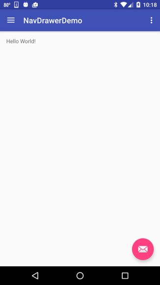
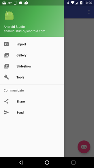
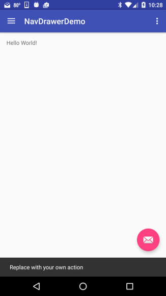
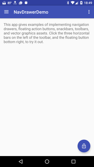
Run the app on a phone, tablet, or an emulator. You should be presented with an opening screen that looks like the figure below left. If you click on the three horizontal bars on the left of the toolbar the navigation drawer should open to a display like the figure below right.
 |
 |
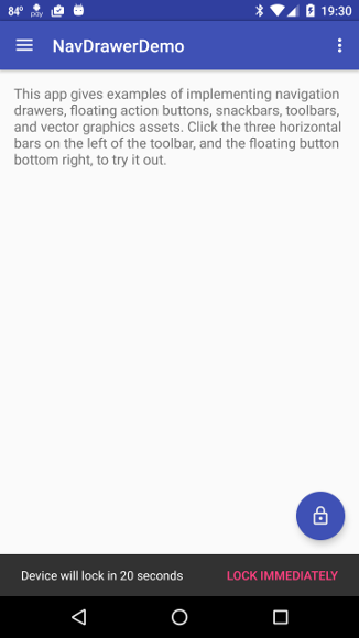
If you click on items in the displayed menu nothing should happen except that the navigation drawer will close. Close the navigation drawer by clicking on an item or by swiping left. Then click on the floating icon at the lower right. This should generate a snackbar with a default message that appears briefly at the bottom of the screen, as illustrated in the following screenshot.
|
These tests indicate that the layout and event logic for the project are working, albeit with place-holders for actions. Let's first examine and understand the code implementing this functionality. Based on that understanding we shall then modify the app to replace the default functionality with useful options.
The primary layout and functionality is contained within a single java file, MainActivity.java, four layout files
some vector-graphic image resources stored in res/drawables, a menu file res/menu/activity_main_drawer.xml, and styles defined in res/values/styles.xml.
Let us begin with the visual layout. Initially res/layout/activity_main.xml has the content
<?xml version="1.0" encoding="utf-8"?>
<android.support.v4.widget.DrawerLayout
    xmlns:android="http://schemas.android.com/apk/res/android"
    xmlns:app="http://schemas.android.com/apk/res-auto"
    xmlns:tools="http://schemas.android.com/tools"
    android:id="@+id/drawer_layout"
    android:layout_width="match_parent"
    android:layout_height="match_parent"
    android:fitsSystemWindows="true"
    tools:openDrawer="start">

    <include
        layout="@layout/app_bar_main"
        android:layout_width="match_parent"
        android:layout_height="match_parent" />

    <android.support.design.widget.NavigationView
        android:id="@+id/nav_view"
        android:layout_width="wrap_content"
        android:layout_height="match_parent"
        android:layout_gravity="start"
        android:fitsSystemWindows="true"
        app:headerLayout="@layout/nav_header_main"
        app:menu="@menu/activity_main_drawer" />

</android.support.v4.widget.DrawerLayout>
As we will see below, the entry activity MainActivity.java sets this as the initial content view. It defines a DrawerLayout container, which contains a NavigationView and inserts the XML res/layout/fileapp_bar_main.xml through an <include/> tag.
As discussed in
Reusing Layouts, if
a complex custom view is expected to be reused, one can define the layout once in a view, and then use <include/> and <merge/> tags to embed the view in other layouts.
The <include/> tag inserts a layout directly into another layout, just as if it had been defined there. In the current project the view defined in activity_main.xml includes the view defined in app_bar_main.xml through
and app_bar_main.xml in turn includes a layout defined in content_main.xml through The <merge /> tag plays a more subtle role by eliminating redundant view groups in a view hierarchy when including one layout within another. Since it isn't used in this project, the reader is referred to Reusing Layouts for further description of the <merge /> tag and its usage. |
The menu that will be displayed in the NavigationView layout is defined in the file menu/activity_main_drawer, as specified by the app:menu attribute of the NavigationView element. It has the content
<?xml version="1.0" encoding="utf-8"?>
<menu xmlns:android="http://schemas.android.com/apk/res/android">

    <group android:checkableBehavior="single">
        <item
            android:id="@+id/nav_camera"
            android:icon="@drawable/ic_menu_camera"
            android:title="Import" />
        <item
            android:id="@+id/nav_gallery"
            android:icon="@drawable/ic_menu_gallery"
            android:title="Gallery" />
        <item
            android:id="@+id/nav_slideshow"
            android:icon="@drawable/ic_menu_slideshow"
            android:title="Slideshow" />
        <item
            android:id="@+id/nav_manage"
            android:icon="@drawable/ic_menu_manage"
            android:title="Tools" />
    </group>

    <item android:title="Communicate">
        <menu>
            <item
                android:id="@+id/nav_share"
                android:icon="@drawable/ic_menu_share"
                android:title="Share" />
            <item
                android:id="@+id/nav_send"
                android:icon="@drawable/ic_menu_send"
                android:title="Send" />
        </menu>
    </item>

</menu>
which specifies labels and icons for menu items, with the icons discussed further below. The file res/layout/app_bar_main.xml included in activity_main.xml has the content
<?xml version="1.0" encoding="utf-8"?>
<android.support.design.widget.CoordinatorLayout
    xmlns:android="http://schemas.android.com/apk/res/android"
    xmlns:app="http://schemas.android.com/apk/res-auto"
    xmlns:tools="http://schemas.android.com/tools"
    android:layout_width="match_parent"
    android:layout_height="match_parent"
    android:fitsSystemWindows="true"
    tools:context="com.lightcone.navdrawerdemo.MainActivity">

    <android.support.design.widget.AppBarLayout
        android:layout_height="wrap_content"
        android:layout_width="match_parent"
        android:theme="@style/AppTheme.AppBarOverlay">

        <android.support.v7.widget.Toolbar
            android:id="@+id/toolbar"
            android:layout_width="match_parent"
            android:layout_height="?attr/actionBarSize"
            android:background="?attr/colorPrimary"
            app:popupTheme="@style/AppTheme.PopupOverlay" />

    </android.support.design.widget.AppBarLayout>

    <include layout="@layout/content_main"/>

    <android.support.design.widget.FloatingActionButton
        android:id="@+id/fab"
        android:layout_width="wrap_content"
        android:layout_height="wrap_content"
        android:layout_gravity="bottom|end"
        android:layout_margin="@dimen/fab_margin"
        android:src="@android:drawable/ic_dialog_email" />

</android.support.design.widget.CoordinatorLayout>
The root of this layout is a CoordinatorLayout, which is a FrameLayout with "super powers". It contains an
Finally notice that app_bar_main.xml, which was included in activity_main.xml, itself includes another file, layout/content_main.xml, with the following content,
<?xml version="1.0" encoding="utf-8"?>
<RelativeLayout
    xmlns:android="http://schemas.android.com/apk/res/android"
    xmlns:tools="http://schemas.android.com/tools"
    xmlns:app="http://schemas.android.com/apk/res-auto"
    android:layout_width="match_parent"
    android:layout_height="match_parent"
    android:paddingLeft="@dimen/activity_horizontal_margin"
    android:paddingRight="@dimen/activity_horizontal_margin"
    android:paddingTop="@dimen/activity_vertical_margin"
    android:paddingBottom="@dimen/activity_vertical_margin"
    app:layout_behavior="@string/appbar_scrolling_view_behavior"
    tools:showIn="@layout/app_bar_main"
    tools:context="com.lightcone.navdrawerdemo.MainActivity">

    <TextView
        android:text="Hello World!"
        android:layout_width="wrap_content"
        android:layout_height="wrap_content" />
</RelativeLayout>
which places a TextView in the main layout.
Now let us consider the functionality. The app is controlled by a single class defined in MainActivity.java, which extends AppCompatActivity and implements the NavigationView.OnNavigationItemSelectedListener interface. It has the initial content
package <YourNamespace>.navdrawerdemo;

import android.os.Bundle;
import android.support.design.widget.FloatingActionButton;
import android.support.design.widget.Snackbar;
import android.view.View;
import android.support.design.widget.NavigationView;
import android.support.v4.view.GravityCompat;
import android.support.v4.widget.DrawerLayout;
import android.support.v7.app.ActionBarDrawerToggle;
import android.support.v7.app.AppCompatActivity;
import android.support.v7.widget.Toolbar;
import android.view.Menu;
import android.view.MenuItem;

public class MainActivity extends AppCompatActivity
        implements NavigationView.OnNavigationItemSelectedListener {

    @Override
    protected void onCreate(Bundle savedInstanceState) {
        super.onCreate(savedInstanceState);
        setContentView(R.layout.activity_main);
        Toolbar toolbar = (Toolbar) findViewById(R.id.toolbar);
        setSupportActionBar(toolbar);

        FloatingActionButton fab = (FloatingActionButton) findViewById(R.id.fab);
        fab.setOnClickListener(new View.OnClickListener() {
            @Override
            public void onClick(View view) {
                Snackbar.make(view, "Replace with your own action", Snackbar.LENGTH_LONG)
                        .setAction("Action", null).show();
            }
        });

        DrawerLayout drawer = (DrawerLayout) findViewById(R.id.drawer_layout);
        ActionBarDrawerToggle toggle = new ActionBarDrawerToggle(
            this, drawer, toolbar, R.string.navigation_drawer_open, R.string.navigation_drawer_close);
        drawer.setDrawerListener(toggle);
        toggle.syncState();

        NavigationView navigationView = (NavigationView) findViewById(R.id.nav_view);
        navigationView.setNavigationItemSelectedListener(this);
    }

    @Override
    public void onBackPressed() {
        DrawerLayout drawer = (DrawerLayout) findViewById(R.id.drawer_layout);
        if (drawer.isDrawerOpen(GravityCompat.START)) {
            drawer.closeDrawer(GravityCompat.START);
        } else {
            super.onBackPressed();
        }
    }

    @Override
    public boolean onCreateOptionsMenu(Menu menu) {
        // Inflate the menu; this adds items to the action bar if it is present.
        getMenuInflater().inflate(R.menu.main, menu);
        return true;
    }

    @Override
    public boolean onOptionsItemSelected(MenuItem item) {
        // Handle action bar item clicks here. The action bar will
        // automatically handle clicks on the Home/Up button, so long
        // as you specify a parent activity in AndroidManifest.xml.
        int id = item.getItemId();

        //noinspection SimplifiableIfStatement
        if (id == R.id.action_settings) {
            return true;
        }

        return super.onOptionsItemSelected(item);
    }

    @SuppressWarnings("StatementWithEmptyBody")
    @Override
    public boolean onNavigationItemSelected(MenuItem item) {
        // Handle navigation view item clicks here.
        int id = item.getItemId();

        if (id == R.id.nav_camera) {
            // Handle the camera action
        } else if (id == R.id.nav_gallery) {

        } else if (id == R.id.nav_slideshow) {

        } else if (id == R.id.nav_manage) {

        } else if (id == R.id.nav_share) {

        } else if (id == R.id.nav_send) {

        }

        DrawerLayout drawer = (DrawerLayout) findViewById(R.id.drawer_layout);
        drawer.closeDrawer(GravityCompat.START);
        return true;
    }
}
In the onCreate method the view is set to the layout defined by activity_main.xml and its included XML files, and the toolbar is layed out. Then a click listener is attached to the FloatingActionButton with an action to launch a SnackBar.
As has been done in various projects, a toolbar is implemented by first declaring a no action bar theme. In this case the style file res/values/styles.xml contains
and in the AndroidManifest.xml file the style AppTheme.NoActionBar is declared for the main activity through the attribute Then, in the onCreate method of MainActivity the lines replace the suppressed actionbar with the toolbar identified by the ID toolbar in app_bar_main.xml, which is inserted in activity_main.xml by an <include/> tag. |
Next in onCreate a DrawerLayout called drawer is is associated with the layout defined by the ID drawer_layout of activity_main.xml and an ActionBarDrawerToggle and an associated listener are defined to allow the drawer to be toggled open and closed, and its state detected.
Finally, a NavigationView called navigationView is defined and associated with the view having the ID nav_view in activity_main.xml, and the setNavigationItemSelectedListener (this) method of NavigationView is used to set a listener on navigationView that will be notified when a menu item is clicked.
| The setNavigationItemSelectedListener (listener) method takes an argument of type NavigationView.OnNavigationItemSelectedListener, but since the present activity implements that interface, the argument can simply be this (the present context). |
The onBackPressed() method that AppCompatActivity inherits from Activity is overridden to detect when the user has pressed the back button on the device, and closes the drawer if it is open so that a returning user will not find the drawer open.
The onCreateOptionsMenu (menu) method is overriden to inflate the actionbar menu (three dots at right of the toolbar). In this case only a single menu item, Settings, is added from the file res/menu/main.xml. The event handler onOptionsItemSelected(menu) is overridden to define actions associated with the menu items, but it contains only placeholder actions and we won't discuss it further.
The primary user interactions with the navigation drawer are handled by overriding the onNavigationItemSelected(MenuItem) method of the NavigationView.OnNavigationItemSelectedListener interface. This uses a series of if--else if statements to decide which button was pressed on items in the open drawer, permitting actions to be taken depending on the choice. Since we should be familiar with such logic from other projects (we have often used switch statements rather than if--else if statements, but the functionality is the same), and the code generated by Android Studio does not implement any specific actions, we won't discuss this method further until we add some actions to it below.
One final item to be discussed for the skeleton project created by Android Studio concerns the image assets used for the drawer menu icons. Unlike the bitmaps that we have used in many other projects for icons, this project illustates the use of vector graphics to define icons (which has been supported since API 21; see Working with Drawables for further information). Since vector graphics are constructed from a set of instructions instead of from displaying a static bitmap, they can be used to specify images at full resolution for any size.
|
In principle, a single vector drawable suffices for any size display. However, it takes more computing power to create a vector graphic when needed than to display a bitmap, so for redrawing performance Android creates one bitmap cache for each VectorDrawable, and referring to the same VectorDrawable means sharing the same bitmap cache, implying that the bitmap will be recreated and redrawn every time size is changed. Hence, if a VectorDrawable is used for different sizes and performance is an issue, it is computationally more efficient to create multiple instances, one for each size.
See the VectorDrawable documentation.
Vector graphics are supported natively in Android only for Lollipop (Android 5; API 21) and later. Vector Graphics Studio can handle vector graphics for versions earlier than API 21 (Android 4.4 and lower) in one of two ways:
|
The icons used in the navigation drawer are defined by XML graphics files placed in the res/drawable directory. For example, the camera icon used in the first item of the drawer menu is specified in the file res/drawable/ic_menu_camera.xml and has the content
<vector xmlns:android="http://schemas.android.com/apk/res/android"
    android:width="24dp"
    android:height="24dp"
    android:viewportHeight="24.0"
    android:viewportWidth="24.0">
    <path
        android:fillColor="#FF000000"
        android:pathData="M12,12m-3.2,0a3.2,3.2 0,1 1,6.4 0a3.2,3.2 0,1 1,-6.4 0" />
    <path
        android:fillColor="#FF000000"
        android:pathData="M9,2L7.17,4H4c-1.1,0 -2,0.9 -2,2v12c0,1.1 0.9,2 2,
        2h16c1.1,0 2,-0.9 2,-2V6c0,-1.1 -0.9,-2 -2,-2h-3.17L15,2H9zm3,15c-2.76,
        0 -5,-2.24 -5,-5s2.24,-5 5,-5 5,2.24 5,5 -2.24,5 -5,5z" />
</vector>
where the tags and attributes are specified in VectorDrawable and the content of the <vector> ... </vector> tag provides a step by step description for how to draw the camera icon.
|
The pathData attribute of the <vector>...</vector> tag specifies a vector drawing path according to the SVG (Scalable Vector Graphics) d attribute syntax (see also Path data). For example, in the above pathData the segment "M9,2L7.17,4 ..." means move (M) to an absolute (x,y) position (9,2), then draw a straight line (L) from there to the absolute position (x,y) = (7.17,4), ...
In general, coordinates are measured from the upper left corner of the viewport, and upper-case letters reference absolute coordinates and lower-case letters reference relative cooordinates. For example, M9,2 means move to absolute coordinates (9,2), but m9,2 means move 9 in the x direction and 2 in the y direction from the present position. |
The file res/drawable/side_nav_bar.xml contains a XML definition of the dark green to light green gradient displayed as background at the top when the navigation drawer is open. This is implemented by the XML
<shape xmlns:android="http://schemas.android.com/apk/res/android"
    android:shape="rectangle" >
    <gradient
        android:startColor="#81C784"
        android:centerColor="#4CAF50"
        android:endColor="#2E7D32"
        android:type="linear"
        android:angle="135"/>
</shape>
where the meaning of the various attributes should be rather clear from their names. (Try changing some of them to see how the displayed gradient is modified.)
Now that we understand the basics of the skeleton app, let's give it some more realistic tasks by modifying both its looks and its functionality. For illustration, we shall change the navigation drawer menu to the following list
and implement corresponding actions. These are fairly simple tasks that can each be accomplished using intents and several lines of code, but they will illustrate generally how to execute (possibly more complex) tasks from the menu exposed by the navigation drawer.
Let's begin by changing some of the displayed text and defining some new strings to be used below. Open res/values/strings.xml and add the strings highlighted in red in the following listing.
<resources>
    <string name="app_name">NavDrawerDemo</string>

    <string name="navigation_drawer_open">Open navigation drawer</string>
    <string name="navigation_drawer_close">Close navigation drawer</string>

    <string name="action_settings">Settings</string>

    <string name="description">This app gives examples of implementing navigation drawers,
    floating action buttons, snackbars, toolbars, and vector graphics assets.
    Click the three horizontal bars on the left of the toolbar, and the floating button
    bottom right, to try it out.</string>

    <string name="webadd">eagle.phys.utk.edu/guidry/android</string>
    <string name="take_picture">Take Picture</string>
    <string name="call_wh">Call White House</string>
    <string name="slide_show">Slideshow</string>
    <string name="google_drive">Google Drive</string>
    <string name="secTitle1">Socialism</string>
    <string name="google_plus">Google +</string>
    <string name="secTitle2">Capitalism</string>
    <string name="play_store">Play Store</string>
    <string name="snackText">Device will lock in 10 seconds</string>
    <string name="snackButtonText">Do Not Lock!</string>
</resources>
Then edit the TextView in res/layout/content_main.xml to read
<TextView
        android:layout_width="wrap_content"
        android:layout_height="wrap_content"
        android:textSize="16sp"
        android:text="@string/description" />
and res/layout/nav_header_main.xml so that the two TextViews read
<TextView
        android:layout_width="match_parent"
        android:layout_height="wrap_content"
        android:paddingTop="@dimen/nav_header_vertical_spacing"
        android:text="@string/app_name"
        android:textAppearance="@style/TextAppearance.AppCompat.Body1" />

    <TextView
        android:id="@+id/textView"
        android:layout_width="wrap_content"
        android:layout_height="wrap_content"
        android:text="@string/webadd"
        android:textAppearance="@style/TextAppearance.AppCompat.Body1" />
Let us change the default icons in our skeleton app to ones more appropriate for the modifications that we will make. This is pretty straightforward because Vector Asset Studio may be used to create vector graphics icons directly in Android Studio according to the following directions.
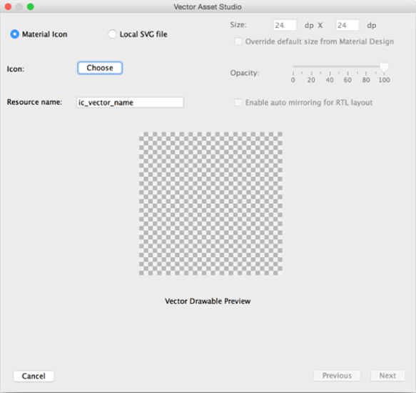
|
|
The new vector asset should appear as an XML file under app/res/drawable.
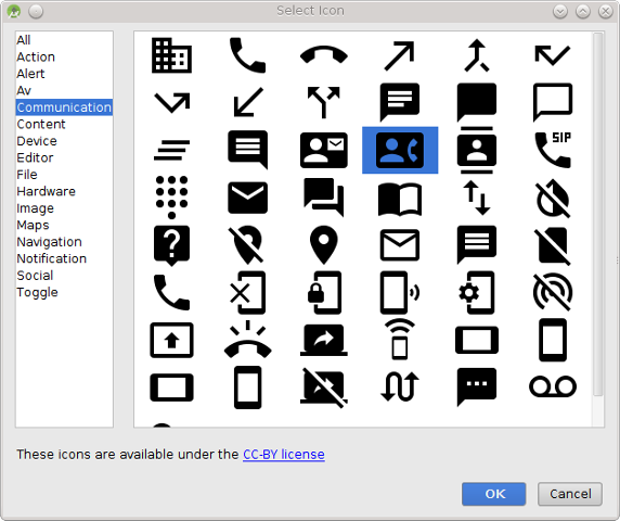
Use Vector Asset Studio as described above to create new vector icons appropriate for
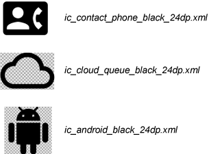
You may make your own choices, but the icons that I will use in the following correspond to the images and names displayed in the following figure (all of which were created at the default size).
|
If you choose different names for your new icon files, you should make the appropriate changes in the following discussion of the code.
| Since they will be replaced by the icons created above, we no longer need the files ic_menu_gallery.xml, ic_menu_manage.xml, and ic_menu_send.xml in the res/drawable directory and you may delete them from the project to save space. Right-click on their names and select Delete. (This will delete them from the project locally; if you are using version control, they will be deleted from the repository on your next commit.) |
By a small modification of the preceding instructions, one may create vector drawables from arbitrary SVG (Scalable Vector Graphics) files in your computer filesystem. Let us illustrate with an SVG file that we shall later use in this project.
You may use a similar procedure to store any SVG file as a vector graphic icon for a project. Various programs can export graphics as SVG. The preceding example was drawn in Adobe Illustrator and saved as SVG, and I have also used Inkscape to draw and save as SVG, but there are other graphics programs that can export SVG also.
After creating the new icons, open res/menu/activity_main_drawer.xml and edit it to read.
<?xml version="1.0" encoding="utf-8"?>
<menu xmlns:android="http://schemas.android.com/apk/res/android">

    <group android:checkableBehavior="single">
        <item
            android:id="@+id/nav_camera"
            android:icon="@drawable/ic_menu_camera"
            android:title="@string/take_picture" />
        <item
            android:id="@+id/nav_gallery"
            android:icon="@drawable/ic_contact_phone_black_24dp"
            android:title="@string/call_wh" />
        <item
            android:id="@+id/nav_slideshow"
            android:icon="@drawable/ic_menu_slideshow"
            android:title="@string/slide_show" />
        <item
            android:id="@+id/nav_manage"
            android:icon="@drawable/ic_cloud_queue_black_24dp"
            android:title="@string/google_drive" />
    </group>

    <item android:title="@string/secTitle1">
        <menu>
            <item
                android:id="@+id/nav_share"
                android:icon="@drawable/ic_menu_share"
                android:title="@string/google_plus" />
        </menu>
    </item>

    <item android:title="@string/secTitle2">
        <menu>
            <item
                android:id="@+id/nav_send"
                android:icon="@drawable/ic_android_black_24dp"
                android:title="@string/play_store" />
        </menu>
    </item>

</menu>
(where, as noted above, you should change the names of the new drawables if you used different ones when you created them).
With the preceding changes the app should be functional, but since we have changed the intended action of some of the buttons from the labels in the default app the IDs for some of the menu items are no longer very descriptive, which makes the code harder to follow (for the programmmer, not for Android!). Let's fix that by using Android Studio's refactoring capabilities to rename some of these IDs globally. In the file activity_main_drawer.xml,
This should rename every occurrence of the ID nav_gallery to nav_call in the project. In the same way,
This refactoring should not change the functionality of the app, but it makes the code more human-readable.
While we are at it, let's also see how to modify the gradient background and icon displayed when the navigation drawer is opened. Open the file side_nav_bar.xml and edit the gradient definition to read
<shape xmlns:android="http://schemas.android.com/apk/res/android"
    android:shape="rectangle">
    <gradient
        android:angle="90"
        android:centerColor="#673ab7"
        android:endColor="#3f51b5"
        android:startColor="#9c27b0"
        android:type="linear" />
</shape>
which changes the linear gradient from green to purple and also changes its orientation. (It will be a little gaudy but this illustrates how to define gradients; feel free to substitute your own aesthetically more sophisticated color scheme for the gradient.)
Now let's change the icon displayed at the top of the navigation drawer when it opens. First add a new color definition to res/values/colors.xml
<color name="colorGray">#eeeeee</color>
Then open res/layout/nav_header_main.xml and change the ImageView tag to read
<ImageView
        android:id="@+id/imageView"
        android:layout_width="wrap_content"
        android:layout_height="wrap_content"
        android:paddingTop="@dimen/nav_header_vertical_spacing"
        android:tint="@color/colorGray"
        android:src="@drawable/solar_system_icon" />
where the android:src attribute now references the res/drawable/solar_system_icon.xml vector graphic that we just created, and the android:tint attribute changes its color.
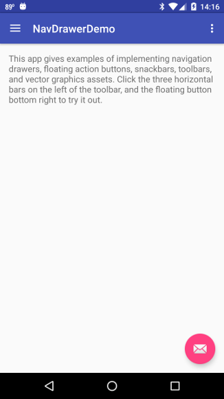
Now if you run the app you should see a screen like the image below left, and if the navigation drawer is opened you should see a screen that looks like the image below right.
 |
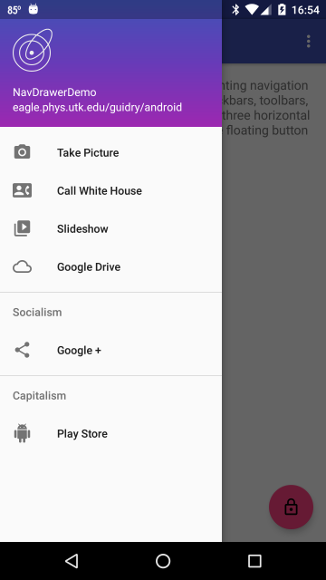 |
where the menu items and icons have been modified to our new ones, and the gradient, text, and icon in the top bar have been changed.
Now let us edit the functionality of the navigation drawer menu, which is all contained in the class MainActivity.java. First we shall deal with an action in MainActivity.java that has been deprecated. If your version of Android Studio created a line in the onCreate method
drawer.setDrawerListener(toggle);
the method setDrawerListener is now deprecated. Modify the line to use the new method that replaces the deprecated method:
drawer.addDrawerListener(toggle);
Now the onNavigationItemSelected(MenuItem item) method must be modified to respond appropriately to clicks on our new menu. Edit the method to read as follows,
public boolean onNavigationItemSelected(MenuItem item) {

        // Handle navigation view item clicks here.
        int id = item.getItemId();

        if (id == R.id.nav_camera) {

            // Handle the camera action
            Intent intent = new Intent("android.media.action.IMAGE_CAPTURE");
            startActivity(intent);

        } else if (id == R.id.nav_call) {

            String number = "202-456-1111";   // White House phone number
            String numberToDial = "tel:" + number;
            startActivity(new Intent(Intent.ACTION_DIAL, Uri.parse(numberToDial)));

        } else if (id == R.id.nav_slideshow) {

            // Will open to your google slides account if you have one, assuming
            // that you are logged into your Google account on the device.

            Intent markerIntent = new Intent(Intent.ACTION_VIEW);
            markerIntent.setData(Uri.parse("https://docs.google.com/presentation/u/0/"));
            startActivity(markerIntent);

        } else if (id == R.id.nav_drive) {

            // Will open to your google drive account if you have one
            Intent markerIntent = new Intent(Intent.ACTION_VIEW);
            markerIntent.setData(Uri.parse("https://drive.google.com/drive"));
            startActivity(markerIntent);

        } else if (id == R.id.nav_share) {

            // Will open to my Google+ homepage.  Change gid to your G+ id
            // to access your G+ page.  To get your id, open Google+ with a
            // browser and click Profile.  The long number displayed as part
            // of the URL in the address bar is your G+ id.

            String gid = "101802627488828432585";
            String add = "https://plus.google.com/" + gid + "/posts";
            startActivity(new Intent(Intent.ACTION_VIEW, Uri.parse(add)));

        } else if (id == R.id.nav_play) {

            // Open the Play Store

            Intent markerIntent = new Intent(Intent.ACTION_VIEW);
            markerIntent.setData(Uri.parse("https://play.google.com/store"));
            startActivity(markerIntent);
        }

        // Close the navigation drawer and return true indicating that the event
        // has been handled.

        DrawerLayout drawer = (DrawerLayout) findViewById(R.id.drawer_layout);
        drawer.closeDrawer(GravityCompat.START);
        return true;
}
where menu-selection logic and Intents have been used in a manner that should be familiar from other projects, and the extensive comments should explain how the action triggered by each menu selection works.
| In the preceding example the code is set to go to my Google+ page if the Google+ menu item is selected. You should customize to go to your Google+ page by changing the value of the variable gid to your Google+ ID number (assuming that you have a Google+ account). To find your Google+ ID number, log into Google+ with a web browser and click on the Profile tab to view your profile. The URL in the address bar should contain a long string of numbers. That string of numbers (just the numbers, not the full URL) is your Google+ ID. |
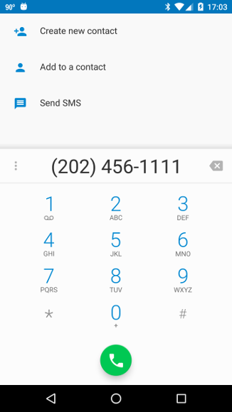
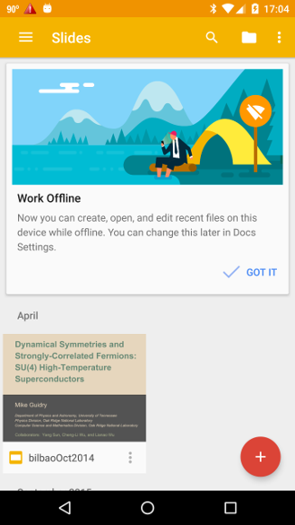
Now execute the app on a phone, tablet, or AVD, open the navigation drawer, and select the various options that we have defined. You should find that the menu selections take you to the desired places. For example, the following two screenshots indicate the result of selecting Call White House (the number works but the person answering probably won't be the President!) and Slideshow respectively,
 |
 |
while the following images display the result of selecting Google + and Play Store, respectively.
 |
 |
Now let us turn our attention to modying the floating action button and the snackbar that it launches.
First, let's replace the icon in the floating action button with a new one. In res/layout/app_bar_main.xml, edit the FloatingActionButton tag to read
<android.support.design.widget.FloatingActionButton
        android:id="@+id/fab"
        android:layout_width="wrap_content"
        android:layout_height="wrap_content"
        android:layout_gravity="bottom|end"
        android:layout_margin="@dimen/fab_margin"
        app:backgroundTint="@color/colorPrimary"
        android:tint="@color/colorGray"
        android:src="@drawable/ic_lock_outline_black_24dp" />
where the last line references one of the new vector drawables that we just created and the android:tint and app:backgroundTint attributes change the colors of the icon and the background circle from their default values of black and colorAccent defined in colors.xml, respectively. Now if you run the app the floating action button should look like the following screenshot,
|
where we see that the background color and icon associated with the floating action button has been changed.
In the original template produced by Android Studio several icon drawables were defined in the file res/values/drawables.xml, which has the listing
These were specified by icons defined in the android namespace; for example, @android:drawable/ic_menu_camera.
Our modifications have now replaced all icons in the app with vector drawables in the namespace of the app (in the directory res/drawable, so that references are of the form @drawable/ic_menu_camera). Hence we no longer need res/values/drawables.xml and you may delete it from the project if you wish. |
Now let's change the action associated with the button to launch a snackbar with both a message and a user-interaction button by editing MainActivity.java. The only change required is to modify the fab.setOnClickListener statement to the form
fab.setOnClickListener(new View.OnClickListener() {
            @Override
            public void onClick(View view) {
                Snackbar.make(view, R.string.snackText, Snackbar.LENGTH_INDEFINITE)
                        .setAction(R.string.snackButtonText, new View.OnClickListener() {
                            // Handle clicks on snackbar button
                            @Override
                            public void onClick(View v) {
                                Log.i("SNACK", "Snackbar button was clicked");
                            }
                        }).show();
            }
});
which uses an anonymous inner class to create a snackbar with a response button, a listener, and a corresponding onClick handler. The key players in this construction are
Notice also that the duration constant has been changed to Snackbar.LENGTH_INDEFINITE, which causes the snackbar to persist until the button is clicked or the snackbar is swiped away. In this example we just send a message to the logcat output when the button is clicked, but in a more realistic situation this would issue some commands, in this hypothetical example to initiate immediately the locking of the device.
| Beginning from the value given to view in Snackbar.make, Snackbar will walk up the view tree trying to find a suitable parent, which is defined as a CoordinatorLayout or the window decor's content view, whichever comes first. Having a CoordinatorLayout in your view hierarchy (as in this project; see app_bar_main.xml) allows Snackbar to enable swipe-to-dismiss and automatic moving of widgets like FloatingActionButton in response to changes in the UI. (Note that the snackbar can be dismissed by a swipe right, and that the floating action button rides up when the snackbar is installed at the bottom of the display.) |
Running the app with these changes and clicking on the floating action button gives a snackbar with action button, as illustrated in the following figure.
|
Clicking on the Lock Immediately button dismisses the snackbar and writes a message to the logcat output. Swiping right will dismiss the snackbar with no action.
| The complete project for the application described above is archived on GitHub at the link NavDrawerDemo. Instructions for installing it in Android Studio may be found in Packages for All Projects. |
Last modified: August 8, 2016